Charts Library

This page will show you how to access and use the Charts Library

The Chart Library houses the different charts you can include in your Project Dashboard. You can view the description of each chart by hovering over the "?" icon with your mouse and adding charts to your dashboard.

Accessing the Chart Library

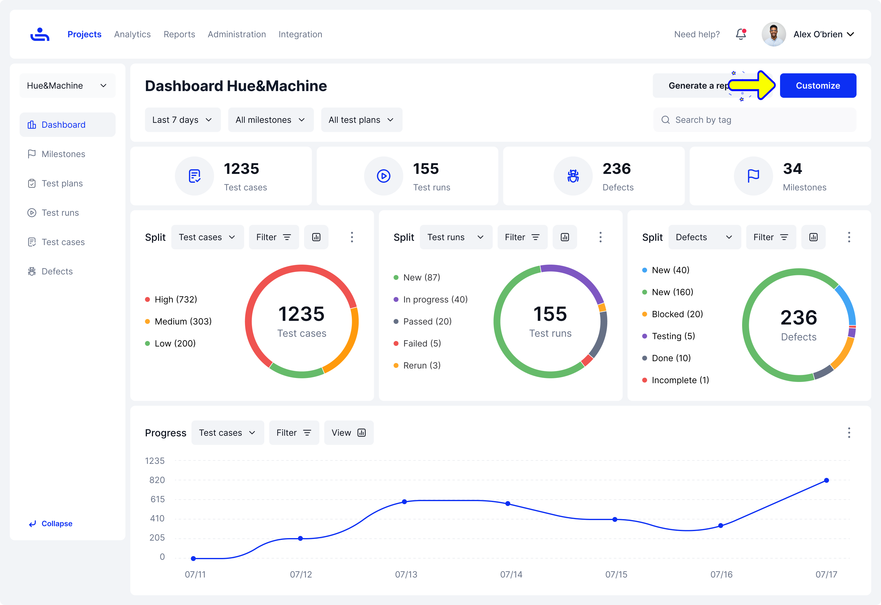
On the Dashboard for a project, click the "Customize" button to open the Chart Library.

Inside of a project Dashboard, click on the customize button.
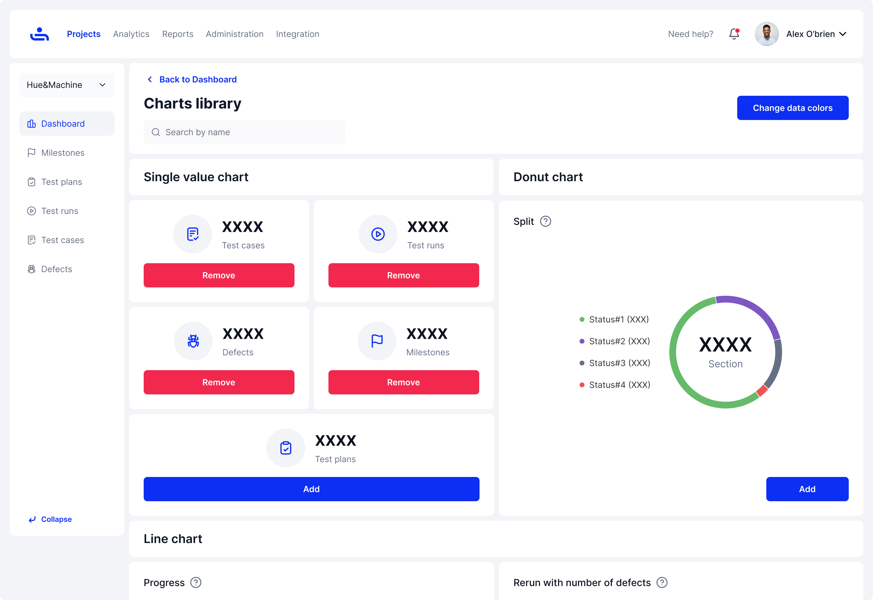
The Chart Library will display allowing you to view and add charts.

Viewing charts and descriptions

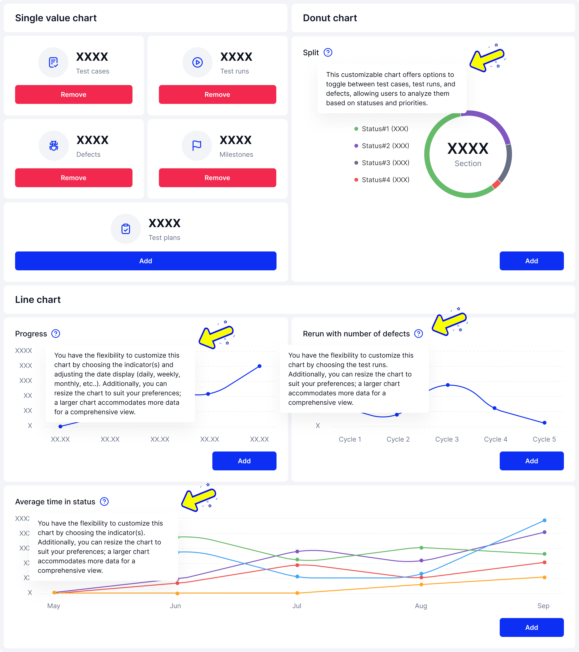
The Chart Library houses the various charts to include in your Dashboard. Below are examples of the different charts.

Single Value, Donut, & Line charts with explanations of each.
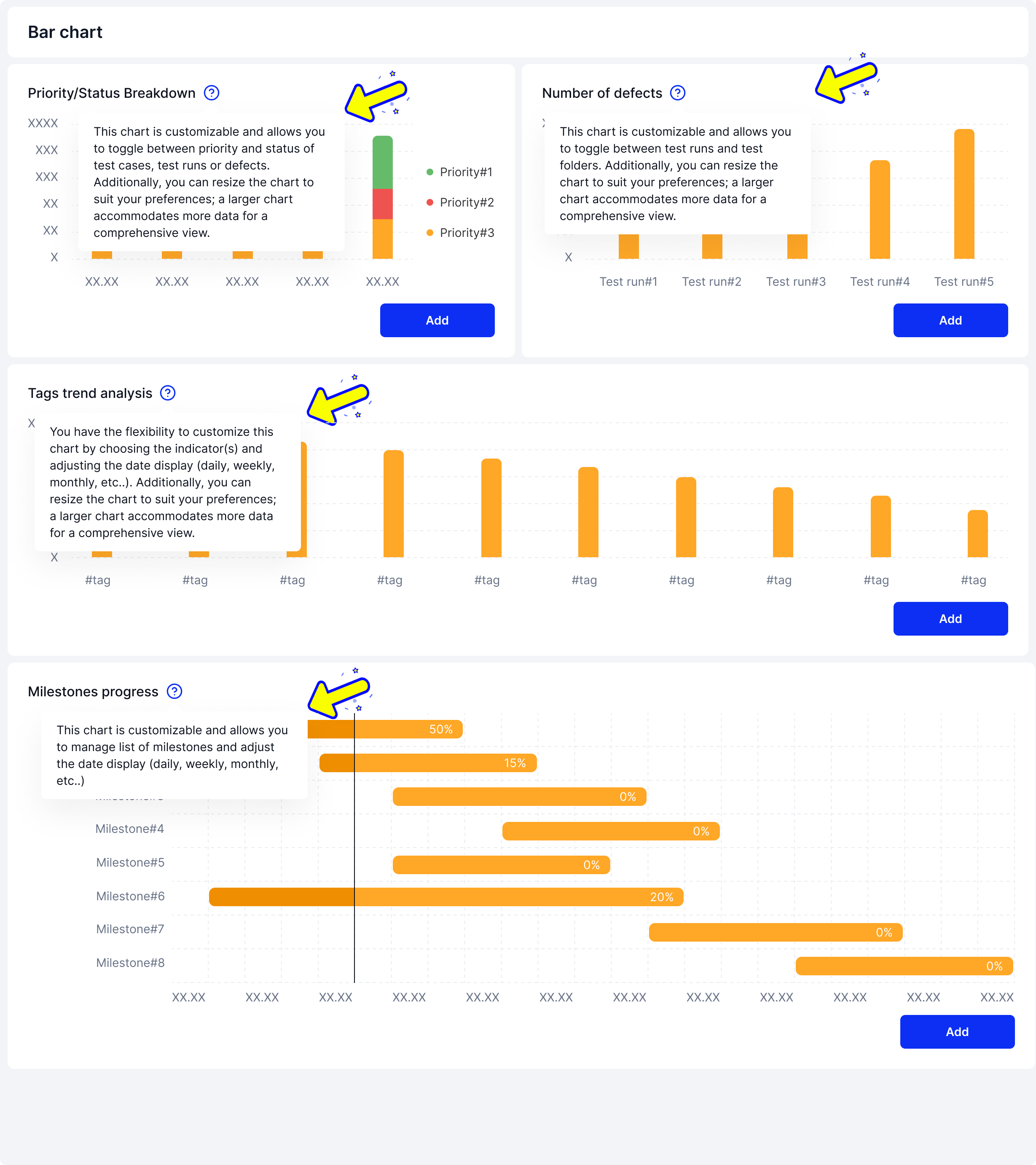
Bar charts with explanations of different datapoints.
Adding a chart to your Dashboard

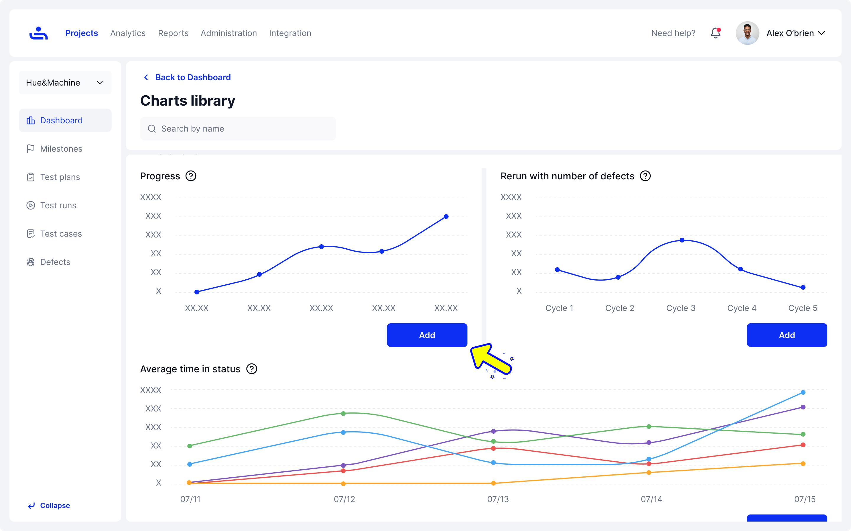
To include a chart in the Dashboard of your project, click on the "Add" button next to the chart you wish to add. Confirm your selection by clicking "Add" or to go back click "Cancel"

In the charts library click add on the chart you wish to include on your Dashboard.
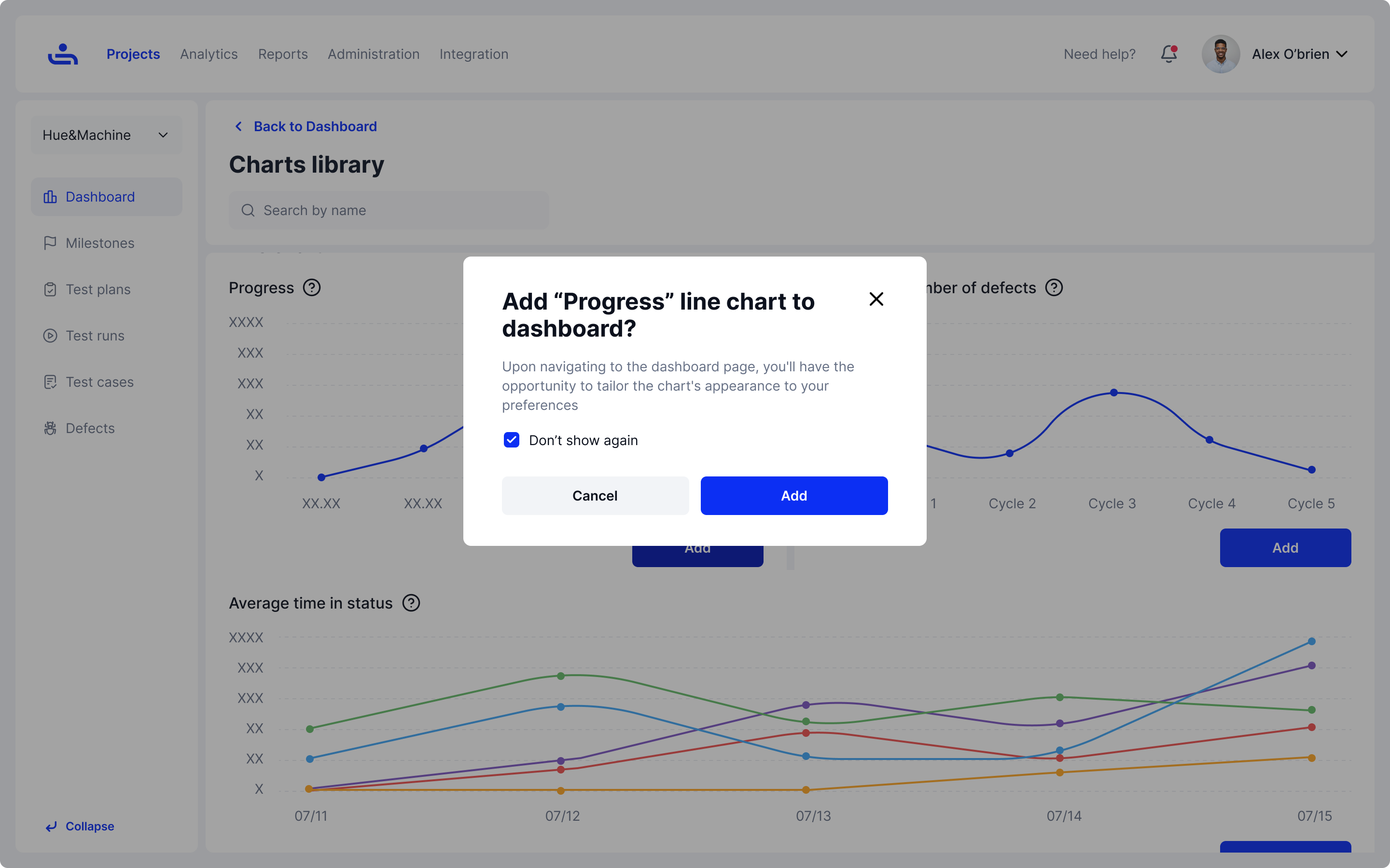
Confirm that you want to add the chart to your Dashboard.

Adjusting Chart Data Colors

You can select "Change data colors" in the Chart Library to sort and customize the different colors used to outline information. Refer to the Data Colors section of the documentation for more info.

In the Chart Library click on the change data colors button to adjust the view of your charts.

If you need to further adjust the Dashboard, the next page will show you how to duplicate, expand, and delete charts. Click "Next"

Last updated